Style & Ideas 10 min read
Pairing the Chromatic Cruiser car T-shirt with colours you already own
A colourful car graphic does not require a new wardrobe around it. Use the Chromatic Cruiser as a starting point for testing familiar neutrals, repeating one visible shade and choosing layers that leave the artwork room to breathe. These practical outfit checks help you work with what is already in your wardrobe.
A car graphic already gives an outfit a subject. The colour decisions around it can be much quieter. Before looking for trousers or a jacket that supposedly matches every part of the artwork, try the pieces you wear most often. The useful question is not whether they repeat the whole design, but whether they let you see it clearly.
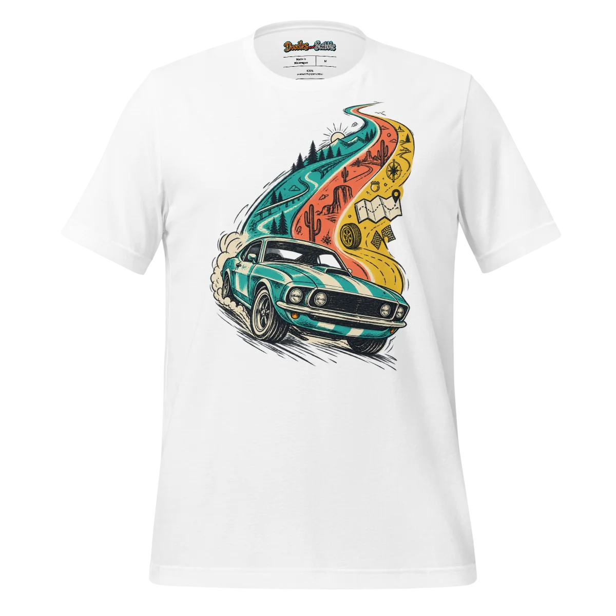
The Chromatic Cruiser Car T Shirt Vintage Car Enthusiast Art puts a vintage-car subject at the centre of that exercise. You can take the motif towards a deliberately nostalgic outfit, but you do not have to. Familiar trousers, an uncomplicated layer and shoes you already like may be enough to give the graphic a setting without turning your clothes into a themed ensemble.
The suggestions below are ways to test your own wardrobe, rather than promises that a particular colour will match this tee. Judge shades against the actual garment where possible. Start with a neutral combination, change one thing at a time, and keep the version that feels natural for your day.
Start with the outfit you already repeat
Choose a pair of trousers you regularly reach for and the shoes you normally wear with them. Keep those two decisions fixed while you try the printed tee. This gives you a familiar baseline: if the combination feels different, you can identify what the graphic has changed rather than assessing three unfamiliar pieces at once.
A simple first test might use your usual dark jeans. Another might use grey trousers or a plain, muted pair you already own. None is an automatic match. Look instead at the overall distribution of light and dark. Does your eye find the car graphic, or does a very bright trouser colour pull attention away from it?
Neutral does not have to mean black. An existing cream, brown or grey piece can be a quieter option, depending on the actual tee in front of you. Lay the garments together before getting dressed. If one neutral looks unexpectedly yellow, blue or stark beside the shirt, try another rather than assuming all neutrals behave alike.
Keep the first version deliberately plain. A patterned jacket, conspicuous belt and contrasting shoes may each work separately, but introducing all three makes it harder to tell which decision is helping. You are building a useful reference outfit, not trying to make the most adventurous combination on the first attempt.
Once you have a baseline you would genuinely wear, remember it. A quick photograph can be more useful than a mental note, particularly if you tend to forget successful combinations. It also gives you something consistent to compare against when you introduce a coloured layer later.
Repeat one visible shade rather than the whole print
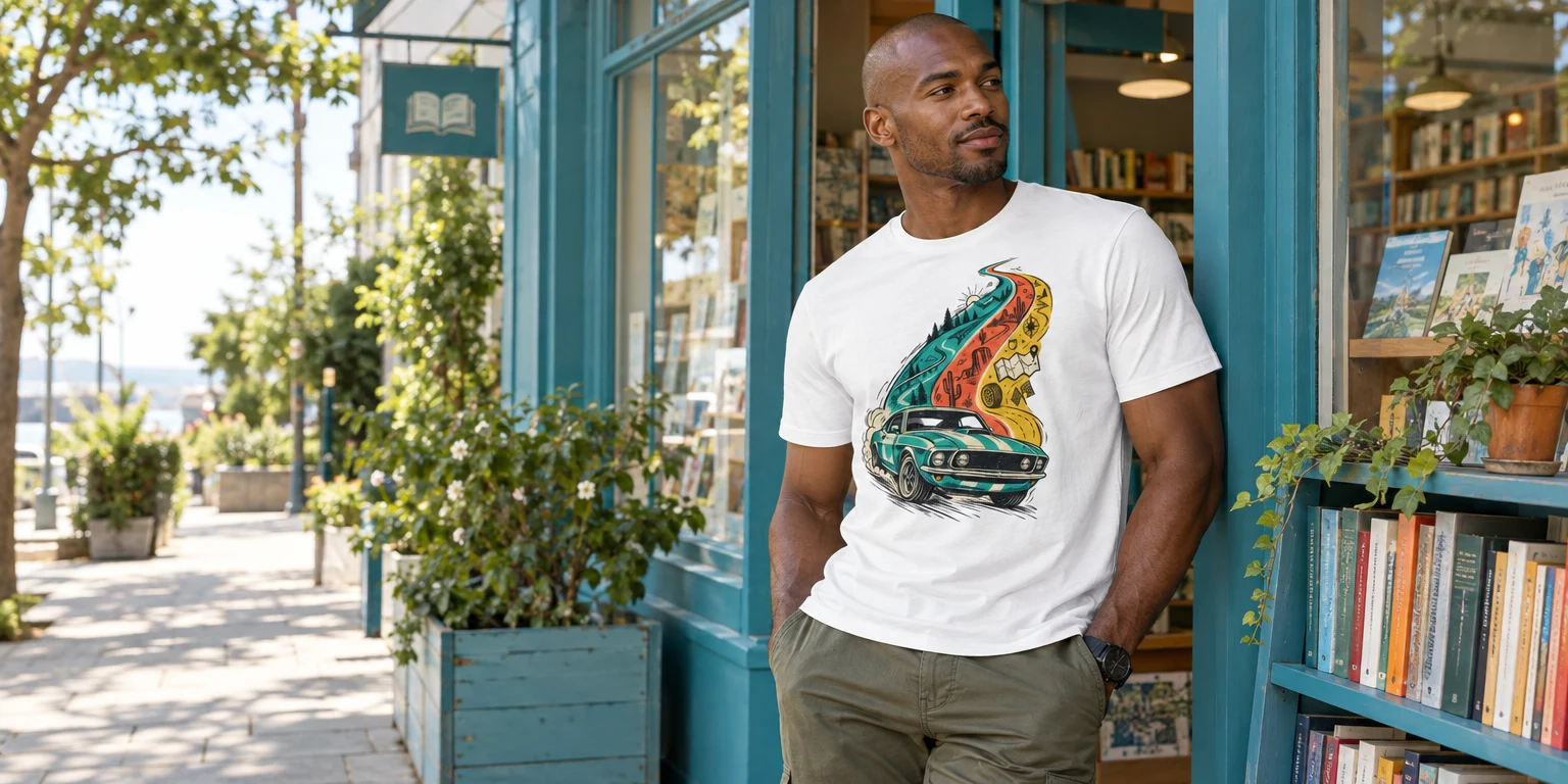
If you want colour outside the graphic, select one shade that you can actually see in the artwork. Hold an existing overshirt, jacket or accessory beside it. A loose relationship can be enough; the two colours need not be identical. What matters is whether the repetition feels intentional when you step back.
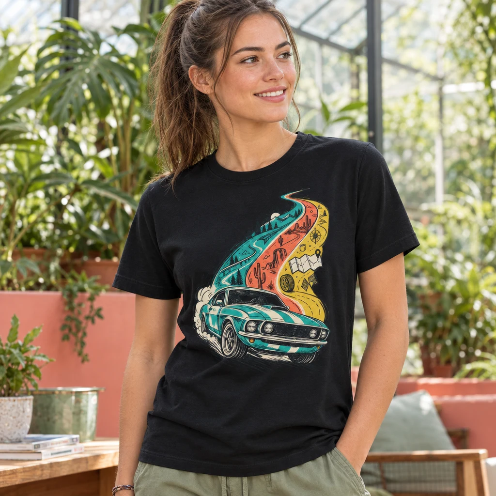
Pay attention to how much space that repeated colour occupies. A small accessory creates a brief connection. A jacket creates a much larger area and may become the dominant part of the outfit. Neither approach is inherently better, but they produce different results. Choose the smaller area if you want the car artwork to remain the first thing you notice.
It is also worth separating hue from intensity. Two pieces might both look broadly green, for example, while one is muted and the other is very vivid. They can still be worn together, but sharing a colour name does not guarantee a quiet pairing. Check the effect in the mirror rather than relying on labels.
Printful’s guide to T-shirt and ink colour combinations recommends light-and-dark contrast to keep designs readable. That advice concerns print design rather than complete outfits, but it offers a useful distinction here: making a graphic clear is not the same task as repeating its colours elsewhere.
The same guide includes dusty rose, sage and mustard as examples of muted, retro-inspired palette choices. Those are possible directions to test if you already own them, not verified colours in the Chromatic Cruiser artwork. There is no need to buy a supposedly vintage shade merely because the subject is a vintage car.
Decide how much of the graphic your layer should reveal
An open layer can give the print a visual frame. Try a plain shirt or jacket you already own, then check where its edges fall across the artwork. A narrow opening may show only a fragment of the car. A wider opening may make the subject easier to recognise, but it also exposes more of the tee and its surrounding colour.
There is no requirement to display every part of the design at all times. For an everyday outfit, a partial glimpse may be enough. If the artwork is the reason you chose the tee that morning, however, it makes sense to avoid a layer that covers its most recognisable area whenever you stand naturally.
Look at the collar area as well. Several contrasting edges near the neck can create a busy upper half before the eye even reaches the graphic. You might prefer a plain open collar, or you might remove the layer altogether. This is a styling decision, not a rule about what belongs over a crew neck.
A useful test takes less than a minute. Put the layer on, leave your arms relaxed, and look from a few steps away. Then sit down and stand again. If you have to keep pulling the jacket apart to make the design visible, decide whether that adjustment is worth it for the occasion.
For more ideas about giving drawn imagery room within an outfit, the Journal’s guide to doodles and scribbles as wearable line art offers a related way into the subject. Here, the practical priority is simple: let the layer support the car motif rather than accidentally dividing it into an unreadable strip.
Balance colour with the shape of the outfit
A combination can have sensible colours and still feel unsettled because of its proportions. Before rejecting a pairing, check the outline. If both the upper and lower halves look expansive, try a straighter trouser shape from your wardrobe. If everything feels tightly contained, a more relaxed layer might give the outfit some breathing room.
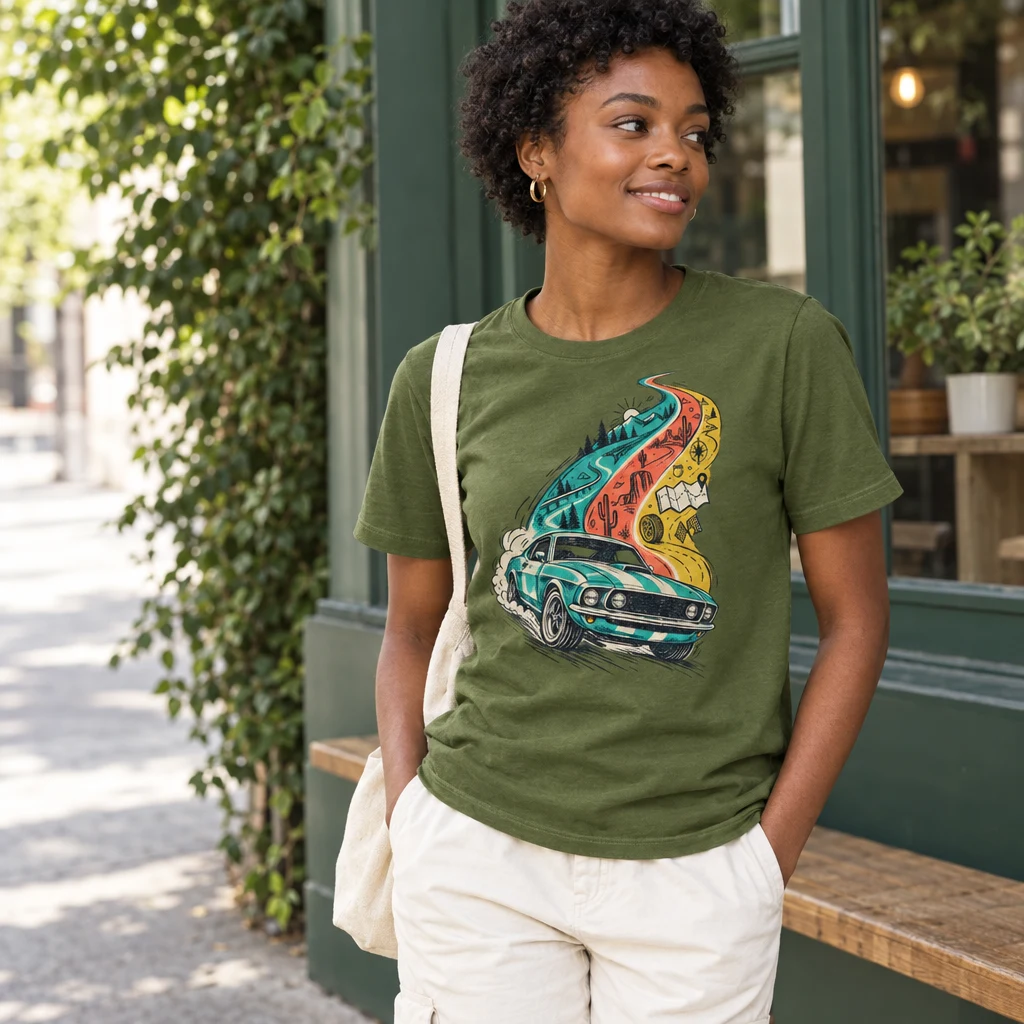
These are experiments with your existing clothes, not claims about the tee’s fit. Use the actual garment to judge where its hem falls and how it sits with your trousers. The position of the graphic matters too: an adjustment that changes the hem may also change how much artwork remains visible.
Try the tee untucked first so you can assess the complete design. If you usually tuck your T-shirts, test that next and check the print rather than only the waistline. A tuck can shorten the visible upper half of an outfit, but it is less useful if it folds away the part of the artwork you wanted to show.
Shoes affect this balance more than their size might suggest. A strongly contrasting pair can make the bottom of the outfit another focal point. Shoes closer in tone to your trousers may feel quieter. Neither choice requires an exact match; compare the two effects using pairs you already wear comfortably.
When something feels wrong, change proportion before adding another colour. Opening a layer, choosing a different trouser shape or simplifying the footwear may solve the problem without introducing anything new. This keeps you from buying a matching accessory to fix what was really a question of shape.
Try three combinations without buying a matching piece
A quiet everyday version
Begin with the Chromatic Cruiser tee, your familiar neutral trousers and understated shoes. Leave out the extra colour echo for now. This version is useful for errands, a casual lunch or any day when you want the graphic to do most of the visual work without giving the rest of the outfit much thought.
The trade-off is that it may feel less deliberately coordinated than a colour-led combination. That is not necessarily a drawback. If you normally dress simply, the car motif can supply enough interest on its own. Check that the surrounding clothes look chosen rather than adding an accessory just to prove the outfit is styled.
A version with one coloured layer
Keep the same trousers and shoes, then introduce a plain layer in a shade that relates to something visible in the print. If you do not own a convincing colour echo, try a muted layer you already like and assess it on its own merits. There is no obligation to manufacture a connection.
This version gives you more colour, but the layer may compete with the artwork when it covers a large area. Compare it open and removed. If you prefer the outfit without it, keep the layer for practical use rather than treating it as an essential part of the styling.
A slightly sharper casual version
Try the tee with your existing plain, more structured trousers and a simple jacket. Keep the other choices restrained so the contrast between the car graphic and the surrounding clothes feels deliberate. This could suit an informal evening plan where you want more definition than your everyday jeans provide.
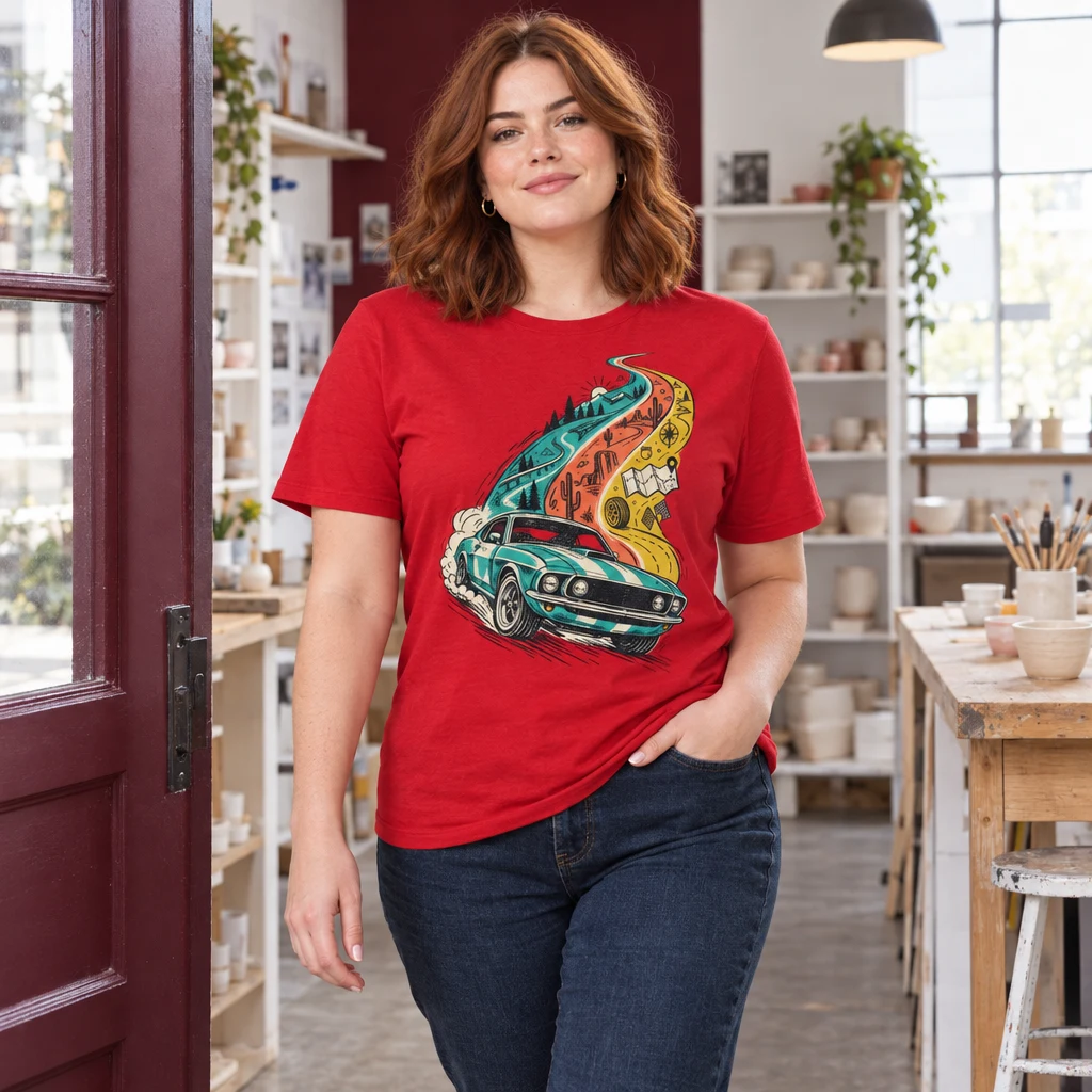
The limit is the setting, not the quality of the combination. A printed tee remains a printed tee; a jacket does not make it suitable for every dress code. If the occasion calls for something specific, follow that requirement rather than expecting careful colour choices to override it.
Use a short wardrobe test to settle the decision
Example — getting ready for a casual Saturday lunch. You have the Chromatic Cruiser tee, familiar dark trousers, a neutral jacket and a coloured overshirt already in your wardrobe. You want the car design to be noticeable, but you do not want an outfit that feels assembled around a costume-like theme.
First, try the tee with the trousers and your usual shoes. Look at the whole outfit from a few steps away. If it already feels complete, that is a valid stopping point. The fact that another layer is available does not mean the combination needs it.
Next, try the neutral jacket. Check whether its opening shows enough of the artwork and whether the shoulder-to-hem outline feels balanced. Then replace it with the coloured overshirt, leaving everything else unchanged. This makes the comparison meaningful: you are testing the layer, not an entirely different outfit.
Finally, ask which version suits both the lunch and your own habits. The coloured overshirt might create an appealing echo, yet still feel more conspicuous than you want. The neutral jacket might look calmer but hide too much of the design. You can choose the plain tee-and-trousers version without considering it unfinished.
- Can you recognise the graphic without rearranging your clothes?
- Does one surrounding colour pull attention away unintentionally?
- Would you wear the trousers and shoes together without this tee?
- Are you comfortable with the outfit both sitting and standing?
- Does the combination work without a new purchase?
If two versions pass those checks, save both. One can become your easy default and the other your option when you want more colour. A useful wardrobe does not require a single perfect answer for every garment.
Know when to stop adding
The easiest way to overcomplicate a car-print outfit is to repeat the subject everywhere. You do not need motoring references in the jacket, footwear and accessories as well. The Chromatic Cruiser already supplies the central idea. Unrelated everyday pieces can make the artwork feel more wearable, not less considered.
Another common trap is chasing an exact colour match. A near-match can look pleasing, but it can also make two slightly different shades seem more obviously different. If you keep comparing them instead of seeing the outfit as a whole, try a neutral or a more clearly distinct colour from your wardrobe.
Use pattern with the same restraint. If you enjoy it, test one patterned piece while keeping the other choices simple. If the result feels crowded, remove the pattern before dismissing the tee. You are deciding how many separate things you want the eye to read, rather than following a ban on mixing graphics.
The most useful endpoint is a small set of repeatable combinations: a quiet baseline, perhaps one colour-led alternative, and a layer that works without constant adjustment. Once those are established, the printed tee becomes easier to wear. Its vintage-car subject can stay distinctive while the rest of the outfit remains recognisably yours.