
Behind the Art 7 min read
Doodles and scribbles as wearable line art
What makes a doodle work on a T-shirt? This visual guide looks at four adult designs through their use of outline, detail, structure and storytelling. From a spare cloud to a pair of perched birds, it offers practical ways to notice what a drawing communicates before choosing one to wear.
Doodles and scribbles work on clothing when their lines give you something to recognise, follow or feel curious about. A simple outline can make its subject clear at a glance; a busier drawing can reward a closer look. Neither approach is automatically better. The useful question is what you want the design to do when it moves from a drawing to something you wear.
Here are four adult T-shirts that take noticeably different approaches to drawn motifs: a cloud, a dreamcatcher, a totem-like form and two birds on a branch. Together, they offer a practical way to look at line art without treating every informal-looking drawing as the same kind of doodle. These are examples to compare, not a ranking or a claim about how the artwork was originally made.
Start with the shape you can spot from a distance
Imagine seeing a printed T-shirt across a room. Before you can inspect any small details, you read its overall shape. Is there one dominant subject? Can you tell where it starts and ends? A design with generous empty space around it can give the eye an easy place to land.
The Whimsical Cloud T-Shirt with Doodle Art is a useful example of that quieter approach. Its cloud is described through minimal black lines with a touch of light blue. The subject does not need a background scene to be legible. The curved outline does much of the work, while the small amount of colour keeps the drawing from feeling entirely monochrome.
Look at how much of the design you can understand without reading its name. If the cloud catches your eye first and the linework still interests you close up, that is a good sign that its simplicity suits your taste. If you prefer several things to discover in one image, you may be happier with a more detailed drawing instead.
There is a distinction here between simple and unfinished-looking. A small number of lines can create a deliberate, complete image. When browsing doodles and scribbles, try describing the mark itself before assigning it a mood: is it curved, angular, tightly packed or open? That observation is more reliable than assuming every loose-looking image must be carefree.
Notice what happens when the lines gather
At the other end of the visual scale, a drawing may ask you to slow down. Repeated shapes, intersecting lines and smaller elements can make the eye travel through an image rather than take it in all at once. That can be appealing when you want the print to invite a second look.
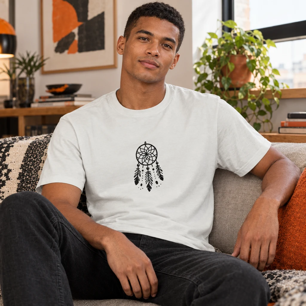
The Dreamweaver Scribble T-Shirt - Slumber's Guardian features a dreamcatcher motif with a web, feathers and beads described in its catalogue artwork. Instead of reducing the subject to a single outer contour, it gives you elements to trace within the larger form. You can read the motif first, then look again at how its parts relate to one another.
There is no need to assume that detailed artwork was drawn spontaneously just because a product uses the word “scribble”. A finished print can have an informal or hand-drawn appearance while still being carefully composed. What you can assess as a viewer is the visible result: which lines are doing the descriptive work, and which add texture or rhythm?
When choosing a more intricate print, consider how you normally wear graphic clothing. If you tend to leave the front of a tee visible, you may enjoy having more detail there. If a jacket or overshirt often covers part of the image, ask whether the central motif remains recognisable when you see only some of it. This is a styling question, not a promise about how any particular garment will look on you.
For a broader look at drawing as an artistic practice, Tate’s introduction to drawing is a useful independent starting point. It offers context for thinking about drawn marks beyond their use on clothing; it is not a description or endorsement of these products.

Compare structure with looseness
Not every doodle relies on soft curves. Some drawings feel more organised because their elements stack, repeat or hold to a central axis. You can still see playful or varied marks within that structure. The contrast is worth noticing: a firm overall arrangement can make individually irregular lines easier to read.
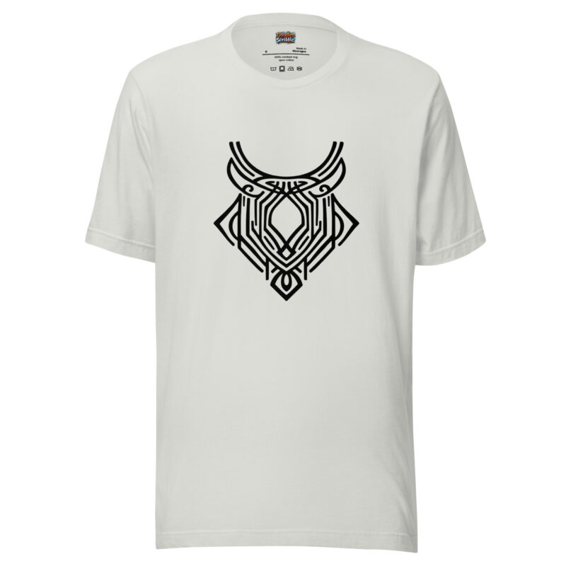
The catalogue describes the Mystical Totem Doodle T-Shirt - Tribal Spirit as featuring a totem-like scribble. Its title and description invite a comparison with the open outline of the cloud: here the interest lies more in a built-up, emblem-like arrangement than in one spare contour. Look at the overall silhouette before following its smaller marks. Does the composition feel balanced to you, or is it the variation inside that draws you in?
The product language also uses broad cultural and spiritual terms. A product description alone cannot establish the drawing’s cultural origins, traditional meaning or relationship to any particular community. It is more accurate to discuss the visible, totem-like arrangement than to present it as a documented cultural symbol. If a motif’s provenance matters to your decision, do not infer it from evocative styling language.
This is a helpful habit with any symbolic print. First identify what the image actually depicts or resembles. Then separate your personal interpretation from a fact about its history. A design may remind you of protection, energy or belonging, but that response is yours; it does not prove that the artist intended a specific meaning.
Let a small scene carry the story
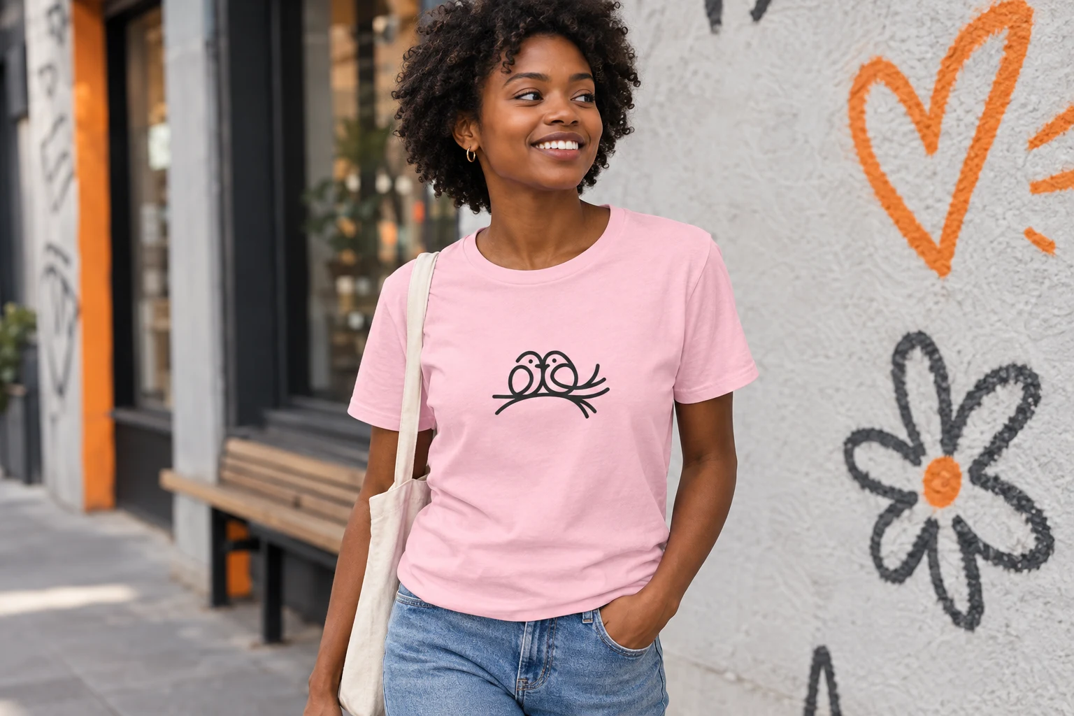
Sometimes the drawn line matters because it connects subjects, not because it makes a complex pattern. A branch beneath two birds creates a relationship in very little space. You can read the figures individually, but you also notice that they share a perch.
That is the appeal of the Lovebirds T-Shirt - Romantic Perch Doodle. Its catalogue describes two birds together on a branch. The image gives a viewer a scene to interpret without needing a detailed setting. You might read it as affectionate; someone else might simply enjoy the neat, companionable arrangement. Both reactions begin with what the drawing presents rather than an invented story about the birds.
Compare this with the cloud. Both have accessible subjects, but one centres a single shape while the other depends on a relationship between two figures. If you like an image that conveys an idea quickly, ask which approach feels more natural to you: one clear object, or a small interaction?
Try the same exercise with any graphic tee you already own. Cover the accompanying words or product name and describe only what is drawn. Then uncover the name. Did it reinforce what you saw, or lead you somewhere you would not have gone on your own? That small pause can help you choose artwork for its visual qualities rather than for a catchy description.
Choose a drawing you will enjoy seeing repeatedly
A useful way to compare these designs is to ask three questions. What do I recognise first? This tests the overall shape. What keeps my eye there? This reveals whether you enjoy spare contours, small details, structured marks or a scene. What am I supplying myself? This helps you distinguish the drawing from the meaning you bring to it.
You can apply those questions to the four motifs without turning them into fixed categories. The cloud offers a restrained outline and a small colour accent. The dreamcatcher has more internal elements to inspect. The totem-like drawing encourages you to consider arrangement as well as individual marks. The lovebirds create a quiet interaction. Each shows a different way a drawn image can hold attention on an everyday T-shirt.
Colour can change how you experience a print, too, so check the actual product page and its available options rather than assuming that the colour shown in an editorial scene is the one you will select. A catalogue listing and its image provide a starting point for looking at the artwork; they are not a live guarantee of supplier stock or of a particular option being available when you order.
If these more contemplative drawn motifs appeal to you, you can browse the Soulful Scribbles collection and compare individual designs on their own pages. Take your time with the pictures. The most useful distinction is not whether a print qualifies as a “proper” doodle, but whether its particular combination of subject, line and space feels like something you would want to live with.
Doodles and scribbles do not have to look alike to belong in the same conversation. One drawing gives you a clear outline; another asks you to follow a web of details; another builds a shape from multiple marks; another suggests a relationship with almost no setting. Once you know which of those experiences you enjoy, choosing wearable line art becomes a more personal and more practical decision.