Style & Ideas 7 min read
Doodle and scribble - when a loose line becomes the point
A doodle can look spontaneous without making an outfit look accidental. From an abstract tangle of lines to a sunflower or a seasonal symbol, this guide explores how the character of a mark changes what you wear around it, and when to give the drawing space.
A scribbled line has a useful quality on clothing: it can interrupt an otherwise orderly outfit without requiring a completely different wardrobe. The question is how much interruption you want. A dense abstract drawing asks for a different backdrop from a single sunflower, and a skeleton hand changes the mood again. Treat the artwork as a design decision rather than assuming every doodle T-shirt needs the same jeans-and-trainers formula.
There is no tidy, universal border between a doodle and a scribble. For styling purposes, it helps to ask what you notice first: the movement of the lines, or the object they describe. That gives you a starting point for colour, layers and occasion. It also helps you decide whether the print should be the loudest part of an outfit or one small surprise within it.
Start with the movement, not the motif
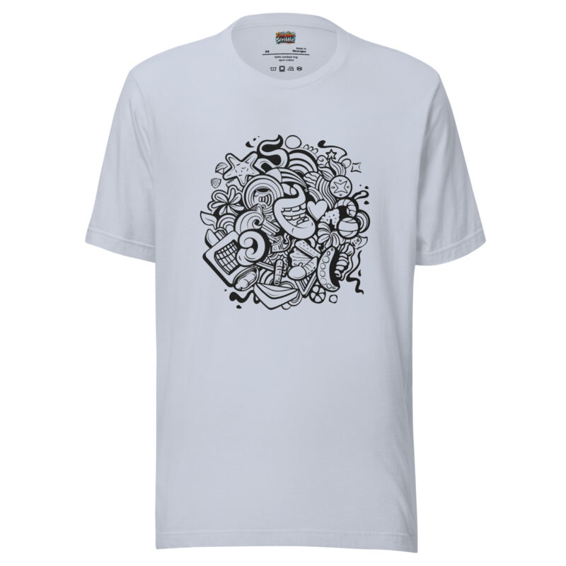
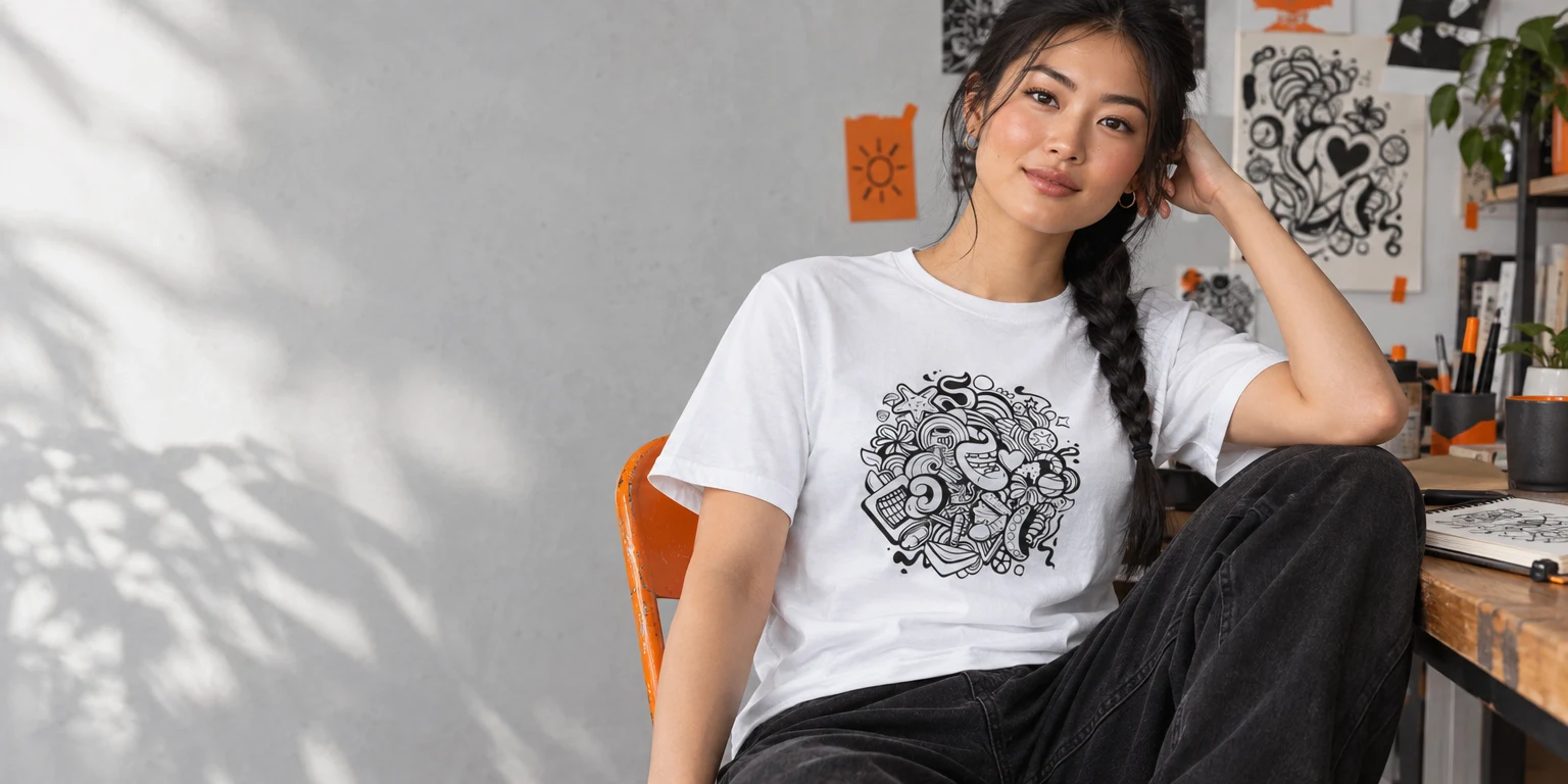
The Abstract Doodle T-Shirt - Whimsical Imagination Explosion is about accumulated shapes and lines rather than one instantly recognisable symbol. With this kind of drawing, your eye moves around the print before it settles. Plain black trousers could give those marks a firm visual boundary; similarly detailed trousers could make the whole outfit harder to read. Neither choice is wrong, but they produce different results.
If you want the drawing to remain the focus, try a quiet lower half and an open outer layer. An unbuttoned shirt or simple jacket would frame the centre of the tee without covering it completely. Fasten the layer and much of the artwork disappears; leave it open and the print becomes a vertical strip. Check the outfit from a few steps away, because a design that reads clearly close up can look busy across a room.
Colour matters as much as line. Listed base-colour options include pebble, pink, light-blue, ocean-blue, silver, citron and white. A pale base might make the artwork feel airy beside dark trousers; citron would make the garment itself a stronger colour statement. With a brighter base, consider repeating that brightness only once elsewhere, perhaps in a small accessory, rather than trying to match every mark in the drawing.

The wider design point is that loose-looking marks can still belong to a deliberate composition. In its account of Jackson Pollock’s Stenographic Figure, the Museum of Modern Art describes rapid doodle and scribble marks over areas of colour as anticipating the calligraphic quality of his later work. That is a point about a painting, not a claim that a printed tee is one. It is a useful reminder that an energetic line and a considered arrangement are not opposites.
Give a recognisable drawing room to breathe
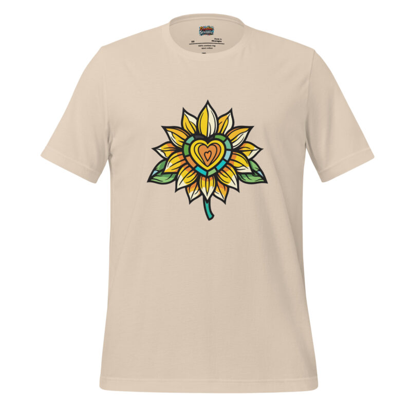
The sunflower on the Sunflower Doodle T-Shirt - Love Core Delight works differently from an abstract cluster. You can identify the flower quickly, and its heart-shaped centre supplies a second detail when you look closer. That two-stage reading makes the design a good candidate for an uncomplicated outfit: you do not need other floral shapes to explain what is happening.
The artwork is described with yellow, green and touches of warm orange. For an easy daytime suggestion, set those colours against blue denim or olive trousers and let one of the flower’s colours connect with the rest of the look. Yellow beside olive would keep the palette related without making the entire outfit match. A sharply contrasting coloured jacket, by comparison, may draw attention away from the smaller details of the print.
Base colour changes the character of this tee too. Soft cream could make the sunflower feel warmer and less stark than white; black-heather could give the yellow a stronger contrast. Those are styling possibilities, not promises about how the final print will look in every light. If you are deciding between versions, compare the product images and think about which base you would wear with clothes you already own.
Proportion is another quiet decision. A drawing on the chest competes with necklaces, scarves and anything that crosses the same area. If you want the heart-shaped centre to be visible, keep accessories away from it or place them above the neckline. If you prefer an outfit in which the motif is only partially seen, a cardigan could soften its outline. Choose the degree of visibility on purpose.
There is also a difference between borrowing a colour and repeating a subject. Green trousers might connect to the sunflower’s leaves without looking like a themed outfit. Another large flower print beside the tee would change the effect from one clear drawing to a conversation between two prints. That can work, but it asks more of scale and spacing than a single-colour echo does.
Use contrast to make the skeleton hand legible
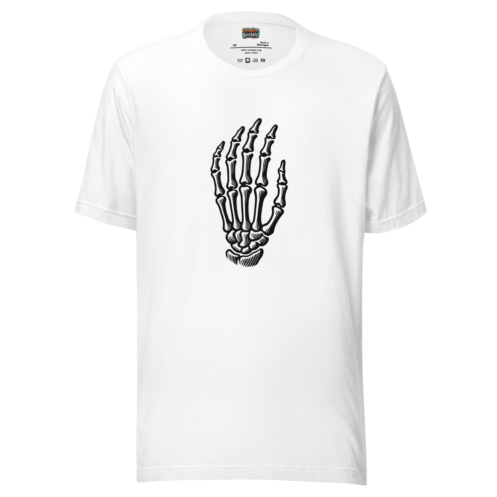
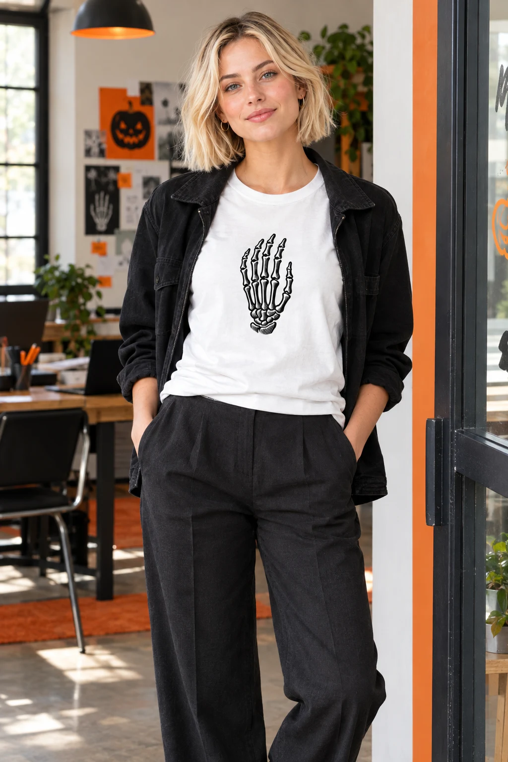
The Skeleton Hand T-Shirt with Halloween Doodle Design relies on a recognisable silhouette and detailed bone lines. Where the abstract tee rewards wandering attention, this drawing delivers its subject almost immediately. That makes it useful for an understated seasonal outfit: one graphic can establish the mood without adding several more symbols around it.
For an evening gathering, you might wear it with dark straight-leg trousers, a plain jacket and shoes you would happily wear again outside the season. The contrast between a composed outfit and a skeletal drawing is more interesting than turning every element into a costume cue. If the event calls for an unmistakably themed look, you can lean further into dark accessories; if it does not, leave the artwork as the only seasonal reference.
Example outfit: Imagine heading from an ordinary afternoon into a casual October get-together. Keep the same dark trousers and simple shoes, then swap a closed jacket for an open one so the skeleton hand becomes visible. The change is small, but it moves the drawing from a private detail to the centre of the look.
Let one bright detail set the palette
The Potion Bottle T-Shirt with Halloween Doodle Design has a different focal point: a green-filled bottle with stars and bubbles around it. The colour tells you where to look before you read the outline. Unlike the skeleton hand, which can sit in a largely monochrome outfit, this design offers a clear accent colour to work with or deliberately leave alone.
One option is to give the green no competition: dark trousers, a neutral outer layer and restrained accessories would make it the clearest bright element. Another is to echo the green in a small item such as socks or a bag. A second large expanse of the same colour could feel more coordinated than you intended, so start with a small repeat and see whether the outfit needs anything else.
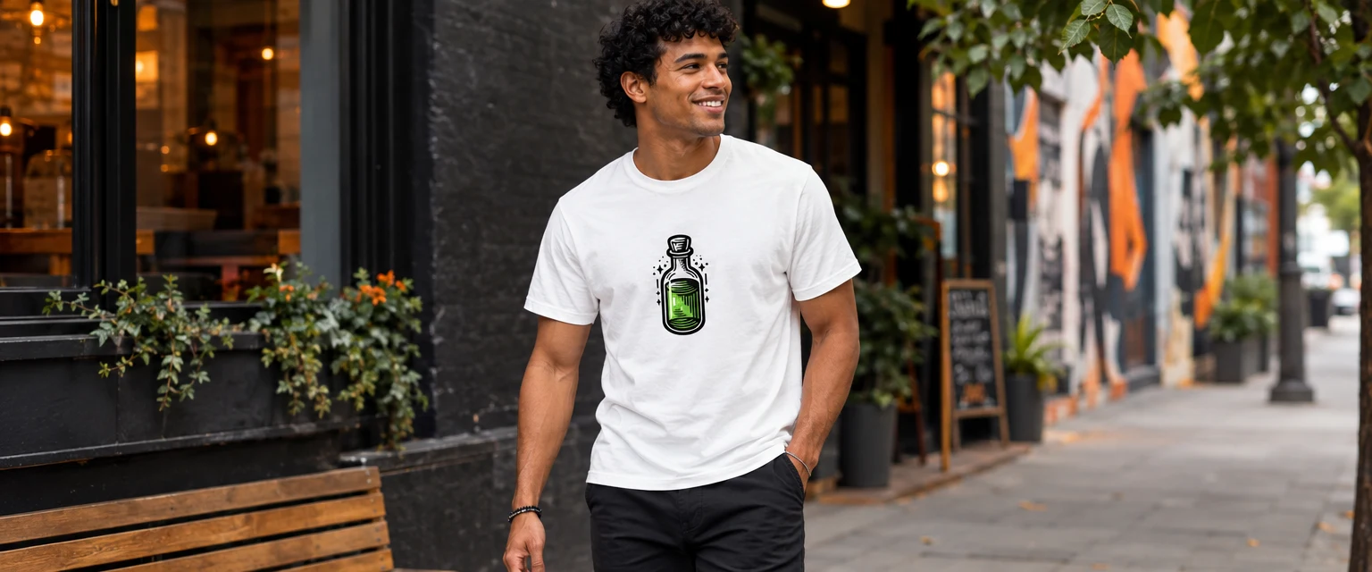
The bottle’s stars and bubbles also make the design more playful than the hand. That difference matters when dressing for an occasion. For a low-key seasonal gathering, the potion graphic could carry the theme while the rest of the clothes stay familiar. In a setting where you want less emphasis on the motif, a plain overshirt could reduce how much of the image is visible. You need not style the same drawing at full volume every time.
Decide how much of the drawing to reveal
A graphic tee can be the whole point of an outfit, or it can appear only when a layer shifts. Neither approach is more authentic. The choice depends on the setting, the drawing and your tolerance for visual noise. Before building the rest of the look, decide whether someone across the room should notice the motif immediately or discover it when they come closer.
For a quieter look, pay attention to where an outer layer’s edges fall. A jacket that covers most of a sunflower may leave a flash of yellow. The same jacket might conceal the defining gesture of a skeleton hand and make the print difficult to understand. Try the layer on rather than assuming it will frame every drawing equally well.
This matters when moving between settings. An abstract tangle can read as a design-led accent under a jacket during the day and a fuller statement once the jacket comes off. A potion bottle remains a more explicitly seasonal signal even when partly covered. Think about the visible fragment; sometimes a cropped motif looks purposeful, while sometimes it simply looks interrupted.
If your starting question is less about the marks themselves and more about assembling an outfit, the Journal’s guide to styling doodle T-shirts looks more closely at trousers, layers and shoes. Here, the first step is simpler: identify whether the drawing asks to be read as movement, a familiar object or a seasonal signal.
Know when to stop adding marks
Try laying out an outfit, then removing one competing element before you put it on. If nothing important is lost, the drawing probably has more room to do its work. If the outfit suddenly feels flat, put that element back. Doodle and scribble are useful precisely because they allow this adjustment: a loose mark can make carefully chosen clothes feel less rigid, while the clothes give the mark somewhere to land.