Clothing 7 min read
Cute doodles clothing: playful style with graphic edge
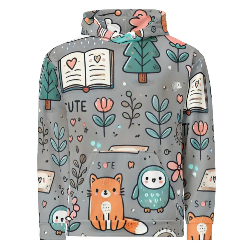
Cute doodles clothing can bring humour and character to an adult wardrobe without tipping into a sugary look. The difference lies in confident linework, a clear focal point, purposeful colour and styling that lets a playful graphic feel properly considered.
Cute doodles clothing can look expressive, graphic and fully adult when the illustration has a clear idea behind it. Choose a design with confident linework, enough space around the artwork and a point of view that suits how you already dress. Then style it as the focal point or a small surprise, rather than trying to make the playfulness disappear.
Cute doodles clothing starts with a confident graphic
Cute is not a category reserved for children. In an adult wardrobe, a smiling face, offbeat animal, wonky flower or hand-drawn symbol can feel witty and self-assured. The subject matters less than the way it is drawn, placed and allowed to speak for itself.
A loose contour has a different energy from a polished cartoon finish. Uneven lines, odd proportions and sketchbook-style marks make the hand behind the drawing visible. That slight imperfection is often where the character lives: it can make a familiar motif feel stranger, sharper and more memorable.
The strongest graphics do not over-explain the joke. A character does not need a crowd of props, speech bubbles and decorative flourishes to be engaging. A direct mark, an expressive silhouette or a single unexpected detail can carry the whole idea. It gives the wearer something playful without making the garment feel overworked.
This is also what makes doodle-led pieces easy to return to. The artwork brings the personality; the rest of the outfit can stay simple. Rather than treating a graphic as an exception to your usual style, think of it as a concise visual interruption: a little humour in an otherwise familiar rotation.
Cute doodles clothing needs one clear focal point
Clothing moves with the body, folds at the waist and is viewed from across a room as well as up close. A graphic therefore needs hierarchy. When every mark asks for attention, the original idea can become difficult to read. When one motif leads, the design has a much better chance of landing quickly.
That focal point might be a small chest illustration, a larger front print or a repeating motif with a recognisable rhythm. Each can work. The question is whether the eye knows where to go first. Supporting details should add texture or reward a second look, not compete with the central drawing.
Scale changes how a doodle enters an outfit. A smaller motif can feel like a private reference, especially beneath an open overshirt or jacket. A larger illustration is more immediate and can set the mood for the whole look. Neither is more grown-up by default. A good composition and a purposeful placement matter more than size alone.
It is worth looking at shape before deciding whether you like a design. Does the character have a silhouette that reads clearly? Is there a strong line or a pleasingly awkward gesture? Does the surrounding space help the artwork rather than crowd it? Those are useful questions when browsing the adult collections and working out which graphic direction feels natural to wear.
White space is especially valuable. It is not a blank area waiting to be filled; it gives an illustration room to register. A lone face, flower or strange little creature can have more presence with breathing space around it than it would among a scatter of unrelated symbols.
Give playful artwork weight with linework and colour
Linework provides structure. A bold dark outline can make even a light-hearted drawing feel deliberate, while a rougher hand-drawn mark keeps the graphic from becoming too slick. The line can communicate as much as the subject: a wobble suggests movement, a heavy contour adds impact and an imperfect curve makes the image feel human.
Colour can support that structure rather than soften it. A limited palette is often enough. One bright accent against a neutral base has energy without turning the whole design into decoration. Equally, monochrome artwork can let the gesture of the drawing do all the work, making a playful motif feel crisp and graphic.
There is a long visual tradition behind this economy. Posters, illustration and printed ephemera often rely on contrast, hierarchy and well-used empty space to make an image memorable. Exploring the V&A’s design collections is a useful reminder that a strong visual message does not require every inch of the frame to be active.
For doodle graphics, that lesson is practical. Let the central line be visible. Avoid adding colour merely because there is room for it. If an accent shade is present, let it direct attention to an eye, word, shape or secondary mark. The result can remain joyful while feeling more like a considered graphic than a pile of cute details.
Style the graphic with contrast, not caution
A playful print does not need to be neutralised to fit an adult outfit. It helps, though, to give it a clear role. Contrast between the loose illustration and more grounded pieces can make the whole look feel intentional.
Denim is an easy companion because it adds familiar texture without competing for attention. Dark trousers can sharpen a lighter graphic, while plain trainers keep the outfit relaxed and practical. If you want more definition, add a structured layer over the artwork. A jacket or overshirt gives a hand-drawn motif a clean frame and creates a useful tension between neat shape and informal linework.
Start by deciding how visible you want the doodle to be. For a quieter day-to-day look, use a smaller graphic as the detail that breaks up a simple outfit. Let it sit beneath an outer layer, or pair it with familiar jeans and uncomplicated shoes. For a bolder approach, make the illustration the centre of the look and keep the other elements calm.
- Wear a larger doodle graphic with plain denim or dark trousers.
- Repeat one colour from the artwork in a small accessory or layer, if it feels natural.
- Choose fewer competing prints when the illustration has lots of detail.
- Add a structured outer layer to sharpen loose, sketchy linework.
- Let a small chest motif work as the unexpected element in an otherwise pared-back outfit.
These are useful starting points, not restrictions. The goal is not to make the drawing behave; it is to make sure it has room to be noticed. A graphic looks most convincing when it appears chosen with pleasure, rather than worn with an apology.
Choose humour that belongs in your wardrobe
The best adult graphic clothing does not ask you to become a different version of yourself. It adds a new note to clothes you already enjoy wearing. If your wardrobe is mostly black, grey, navy or white, a dark line drawing or single vivid accent may be the easiest way in. If you already favour colour, a larger repeated motif may feel more at home.
Look for humour that has a connection to your own taste. Perhaps it is an awkward expression, an odd little creature, a cheerful symbol or a visual idea that is deliberately a bit nonsensical. The point is not to build a costume around it. The point is to find an image whose energy feels recognisable to you.
It can help to think of graphic pieces as part of a rotation. A statement illustration may be the answer when familiar layers feel too plain. A more discreet doodle can become an easy regular piece because it adds interest without taking over. When you want a fresh visual direction, the new-in edit is a useful place to look for recently added adult graphics.
Personal style does not become less defined because it contains humour. Often, one strange or cheerful detail makes an outfit more specific. It suggests that you care about how things look, but do not need every choice to be overly serious.
Keep adult playfulness distinct from Little Humans
Doodles & Scribble keeps its adult clothing and Little Humans offering clearly separate. That distinction matters. Playful artwork can belong in an adult collection without being presented as a children’s aesthetic, and clothing for children can remain designed and identified for children.
For adult pieces, the emphasis can stay on graphic composition, expressive marks, boldness, oddness and everyday styling. A doodle may be charming, but it can also be blunt, weird, energetic or quietly observant. Those qualities give it range beyond sweetness.
Keeping the lines clear also makes choosing easier. Adult shoppers can focus on artwork and silhouettes that suit their own wardrobe, while Little Humans remains its own dedicated space. Playfulness is shared across ages; the product context, presentation and intended wearer are not.
Let the charm stay and edit the excess
Cute doodles clothing works best when it trusts a good idea. Keep the memorable mark, the expressive outline and the small dose of visual nonsense. Then remove what does not help: excess decoration, competing motifs and colour without a purpose.
Whether you prefer a small chest detail or a full front graphic, look for clarity. One confident doodle with room around it can feel more distinctive than a crowded collection of symbols. Styled with simple pieces or a sharper layer, it brings humour to an adult wardrobe while keeping its graphic edge intact.

