Behind the Art 7 min read
How to wear Colourful T-shirts with one bright accent
Start with one of the colours you can see in the lettering. Then try it beside a pair of trousers or a layer you already own. Three Colourful tees show how the same white background can work with denim, olive and navy.
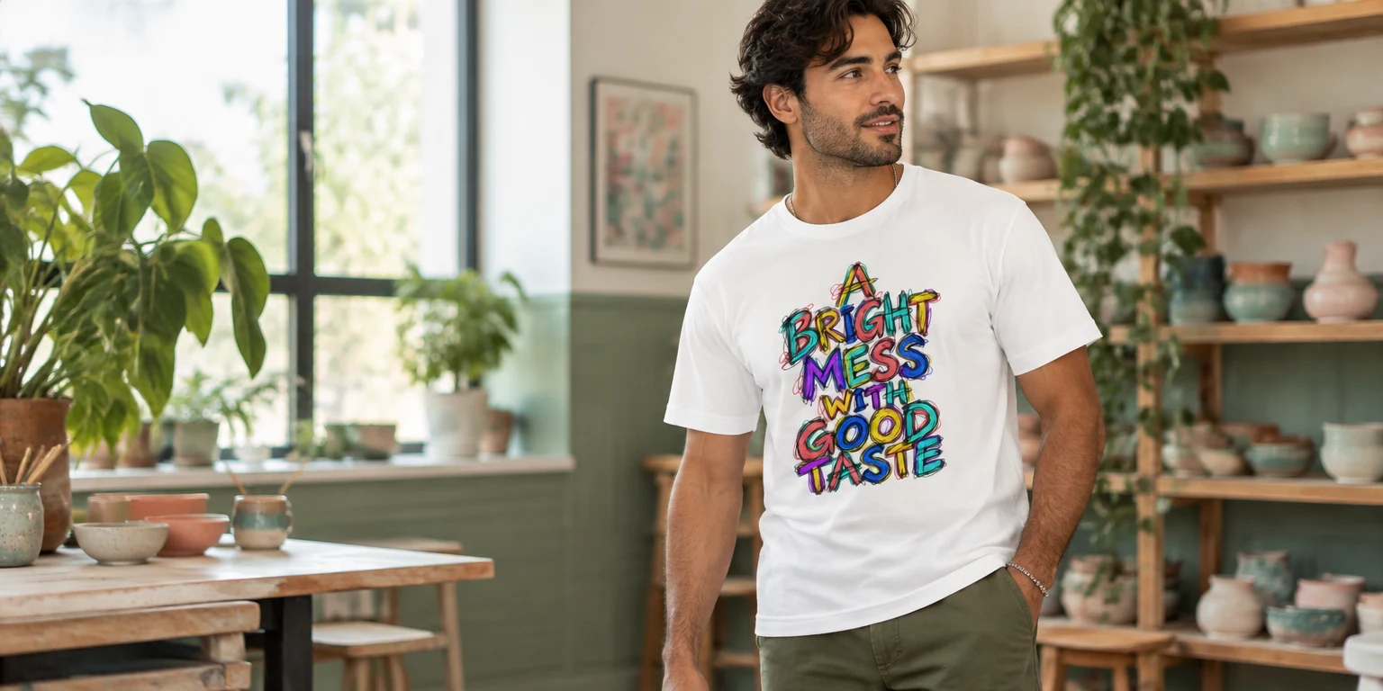
Coral, turquoise and yellow sit beside darker outlines on the A Bright Mess With Good Taste T-Shirt. In the first photo, olive trousers give the white shirt a quiet base. The simplest way to wear Colourful T-shirts is to pick one ink colour you enjoy and see if a piece you own already picks it up.
Start by opening the whole front photo in the Colourful collection. With one shirt your eye may land on a block of yellow first. With another you may notice the dark edges around the letters. Both can give you a colour to try elsewhere in the outfit.
Give Wonder room beside olive trousers
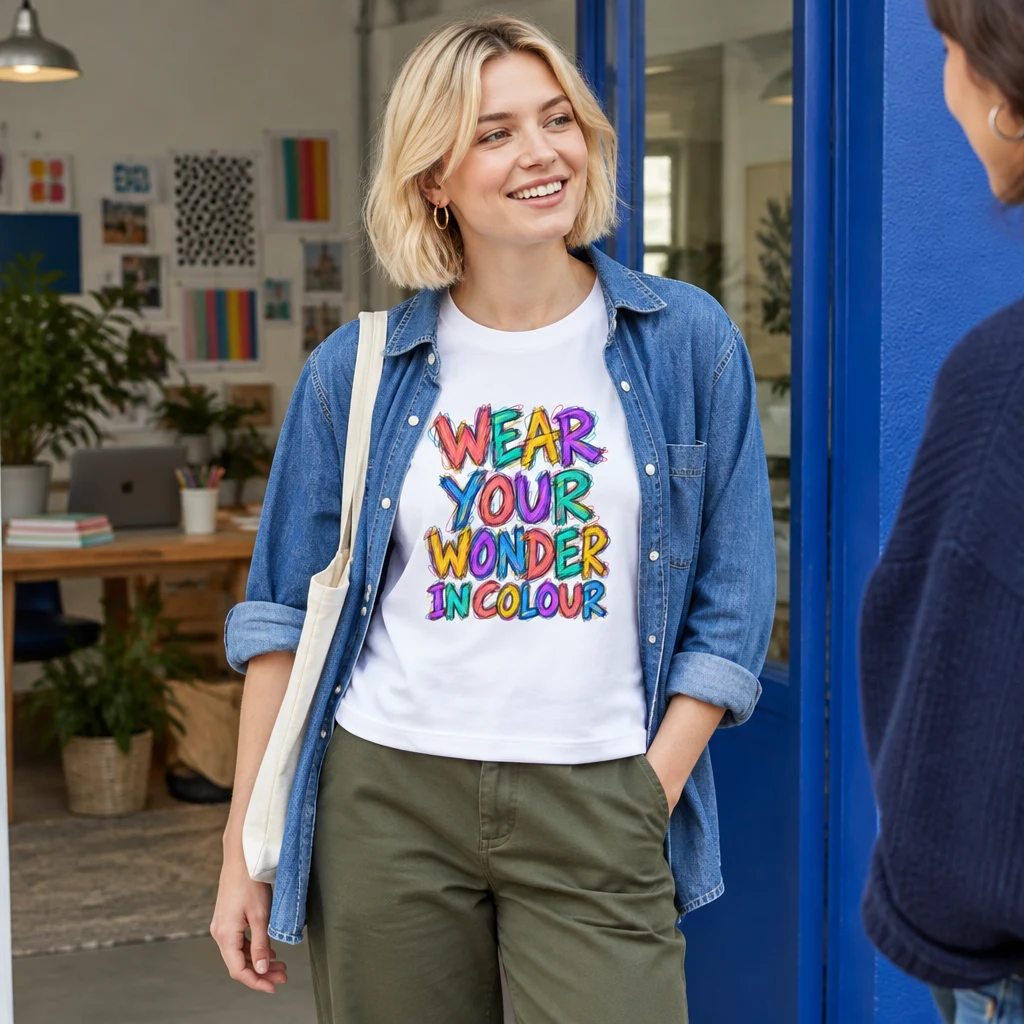
The Wear Your Wonder In Colour T-Shirt has a broad, multicoloured “Wonder” near the centre. The photo pairs it with olive trousers and an open blue denim shirt. Try an open shirt you already own and see whether both sides of that broad word stay visible.
Olive is a strong colour here without being as bright as the letters. The blue denim adds a second connection to the print. Plain trainers work with both. If you already wear white shoes with olive trousers, that’s an easy way to bring the white of the tee into the rest of the outfit.
Leave the denim shirt open far enough to show the whole central word. Because Wonder stretches sideways, narrow strips of visible print can make the design feel cramped. Stand naturally in front of a mirror rather than pulling the shirt edges apart with your hands. That shows how much of the message will actually be visible.
If you prefer the outfit without a layer, keep the same trousers and shoes. There is no need to add a colourful necklace or bag just because the tee has several colours. A plain bag you use every day is enough. The point of this combination is to make room for the lettering, not to construct a perfectly coordinated set.
Frame Brighter Pen with navy layers
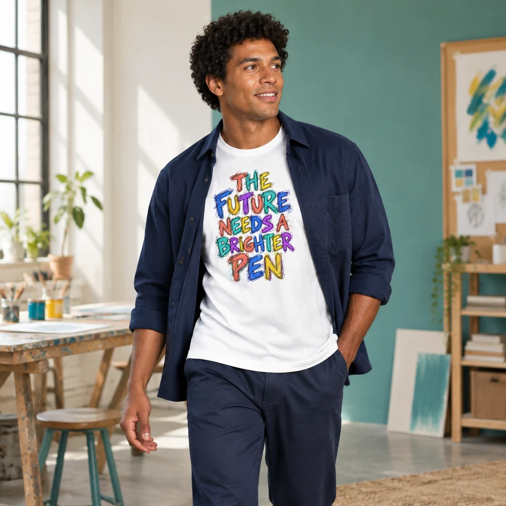
On the The Future Needs A Brighter Pen T-Shirt, the bright letters end with a big “Pen”. The white shirt is shown with navy trousers and an open navy overshirt. The two dark pieces give the design a clear edge, and the lighter blue in the letters gives the eye a way back into the outfit.
The navy pieces create a dark surround for the bright lettering. Blue in the artwork gives that choice a connection to the design, but the outfit does not depend on an exact shade match. A lighter blue mark and a deep navy trouser can sit comfortably together because they share a colour family.
Pay attention to the bottom of this particular print. Its expanding shape gives the final word visual weight, so a tuck that hides PEN takes away part of the composition. Try the tee untucked first. If you prefer a tuck, check that the full message stays above the waistband when you sit down.
This is a useful outfit for a casual lunch or an afternoon out when you want a graphic tee with a little more structure around it. Keep the overshirt unbuttoned while you want the artwork visible. If the weather calls for it to be closed, the navy layers still work together, even though the slogan temporarily disappears.
Try Bright Mess with olive or denim
The Bright Mess photo uses olive trousers and leaves the tee uncovered. For another combination, put the same white tee with mid-blue jeans. The blue in the lettering gives the denim a connection to the print, while coral, yellow and turquoise keep the letters lively.
A plain charcoal jacket can pick up the dark outline if you want a layer. Try it open in front of a mirror. The design is a crowded stack and the smaller words matter too, so see how much of it is left before you add anything else near the chest.
If you have a turquoise bag, put it beside the top and jeans. Look at it in daylight and see whether you like the two blues together. With a bold print you may be happier carrying the plain bag you already use and leaving the colour to the letters.
Check the jacket opening against the whole stack of words. With this design, showing only the centre can leave fragments of several lines visible at once. A wider opening lets the arrangement read properly. On a warmer day, remove the jacket and keep everything else unchanged. The jeans are doing enough work to anchor the print.
Look at the ink and the shirt colour separately
In these three designs the letter fills supply several colours, while the garment underneath stays white in the photos. Open the same design in another shirt colour and see what catches your eye first. A dark shirt may make a light letter feel louder. A bright shirt can make the lettering feel more crowded.
Use the current product page to see the backgrounds available in your size. White, black and navy can give the same artwork quite a different edge. Compare the whole front with the trousers you expect to wear before choosing one.
The three outfits above use white as a straightforward starting point. If you choose another background, reconsider the surrounding clothes rather than assuming the whole look will behave identically. A navy tee with navy trousers creates a larger dark area. A red tee adds a strong colour beyond the small patches within the lettering.
The V&A’s look at colour in menswear shows how different a small bit of colour can feel from a whole garment in a bright shade. An early black doublet with a yellow lining is a useful detail to look for. You can try that difference at home with a bright print under a darker layer.
Choose one colour to repeat
Choose the item you already want to wear first. That might be your comfortable blue jeans or an olive pair of trousers. Then look for a relationship with the tee. Blue denim has a direct link to blue lettering in Bright Mess and Brighter Pen. Olive can sit beside a vivid print without needing to reproduce one of its brightest marks.
Exact matches can become frustrating, especially when a colour occupies only a small part of a letter. A turquoise bag does not need to reproduce the print precisely. It simply needs to look agreeable beside it in ordinary daylight. Put the items next to each other before deciding that the shades are too different.
If a combination feels busier than you intended, remove the extra accent first. Keep the tee and your chosen trousers, then try plain shoes and a quieter layer. That is usually a more useful test than changing every piece at once.
The Journal’s guide to pairing a car print with familiar colours uses a different design to try the same idea. Put the tee next to the clothes you want to wear and see which colour makes you look back at the print.
Check the outfit while you move
Once the colours feel right, check the lettering in motion. Sit down, reach forward and put on the jacket or shirt you plan to wear. A composition that looks clear while you stand still may fold across its main word when tucked or layered.
Look at the outfit from a few steps away, too. Close up, you notice individual loops and changes of colour. At a distance, you see the overall block of lettering and the space around it. Both views help you judge whether a layer is framing the design or hiding too much of it.
Finish with an outfit you can see yourself wearing twice. Try Wonder under an open denim shirt, Brighter Pen with navy, or Bright Mess with your usual jeans. If the letters stay clear and you like the colours together in daylight, leave it there.
Find your favourite
The pieces in this story, together in one place.
Explore the collection